What we design for
Text is at least 18 pixels. The main column is wide on a phone, not a narrow rail floating in a margin. Buttons and menu rows are tall enough to tap. The menu is a single control that opens a list, and it works with no script. Pictures have text alternatives. The opening clip on the home is muted and loops, and a still picture stands in its place when motion is reduced. The other pictures wait until you reach them.
We measure against WCAG 2.2 at level AA. That is the standard, not a trophy. A failure is a thing to fix. Color is not the only way a state is shown. Focus is visible. We do not set a scroll trap on a box that has nothing to scroll.
If a page here fights you
Call the phone number in the footer and name the page and the barrier. A form that will not send, a month control that will not open, a sentence a screen reader reads twice. We would rather hear it than have you leave. The same number works if you want the information in another form we can actually produce.
The calendar is a third-party screen inside a frame. It opens only after you ask, so it does not steal the page. If that frame itself is hard to use, say so, and use the phone. The conversation does not depend on the frame.
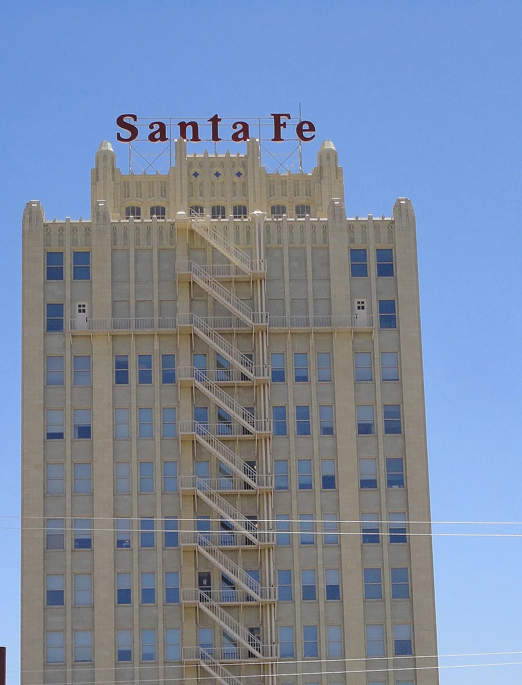
The iron stairs are the fire escape on the Santa Fe building in Amarillo. We have not climbed them. Access on this page means reading the words with less friction. The words stay in the HTML even when the photograph is turned off, and they are the part that has to work. A keyboard reaches the menu, the month list, and the form without a pointer.
